T
Tapley
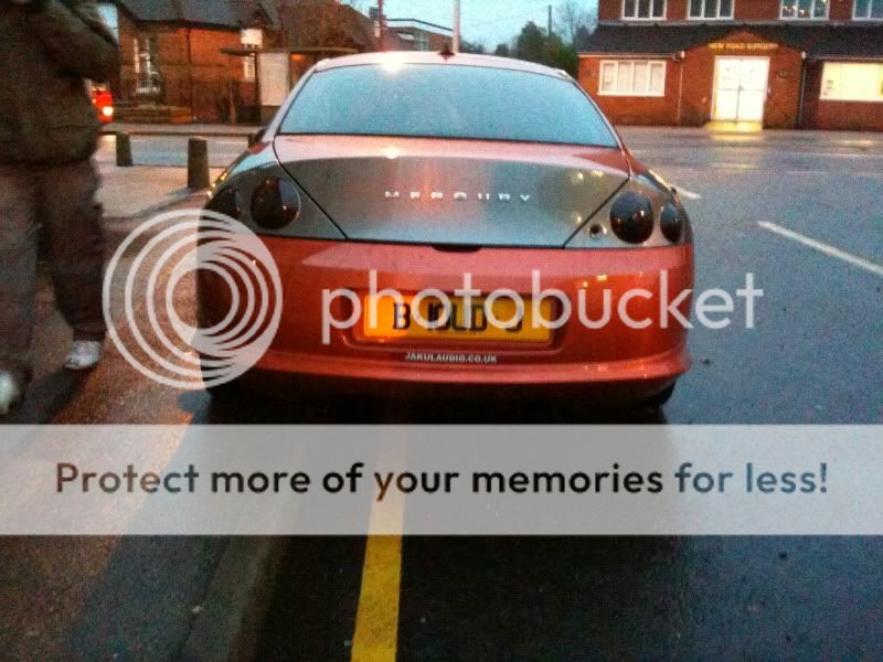
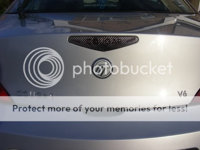
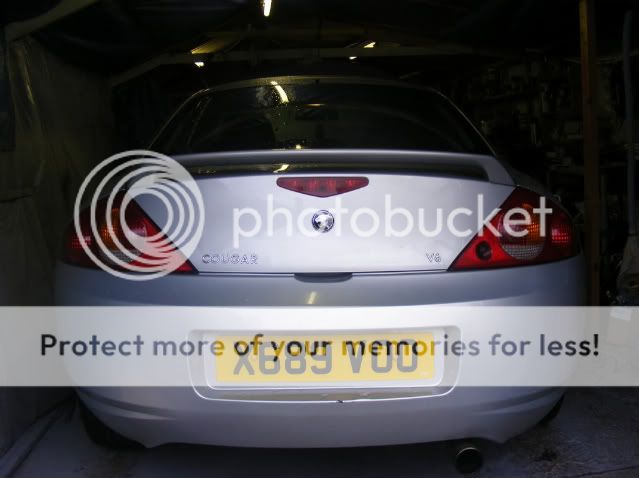
Hey guys i've taken the letters off the back of my cougar and have got some new ones from ebay, i was wondering what you guys think.
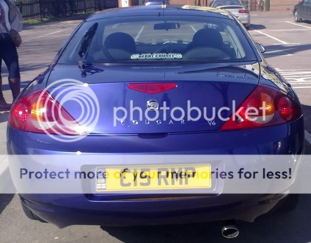
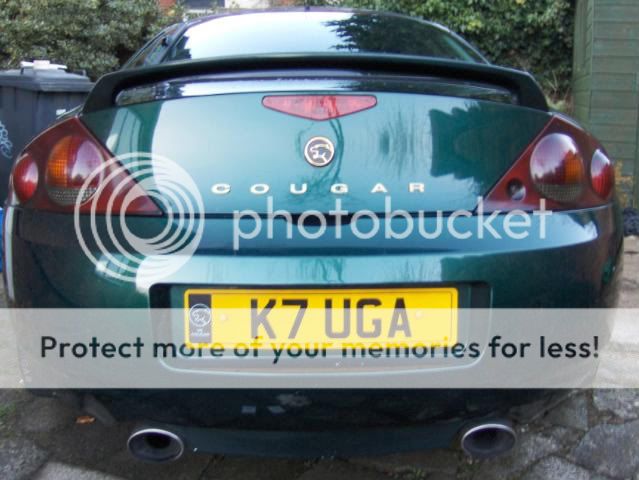
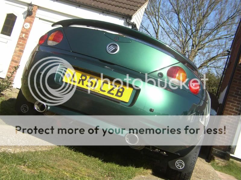
Heres a couple of examples i've seen one being smaller cougar letters spread out the other being larger letters with mercury instead.
http://www.ukcougarforum.com/vb/garage_vehicle.php?do=view_vehicle&id=95
http://www.v6cougar.com/photo.htm
Mine is a mix version of the two but im undecided if it looks good and unique or slightly OTT?
I know its about if i like it or not but i dont want to drive around with it looking silly and being just thinking "what a dick" .
.
The letters arn't that straight as they are just blue tacked in place but any suggestions or thaughts are more than welcome!
Mine = http://img241.imageshack.us/img241/7659/dsc00031px.jpg
I think it looks a bit like the new mustangs have on the back :>
Cheers
Mike
Heres a couple of examples i've seen one being smaller cougar letters spread out the other being larger letters with mercury instead.
http://www.ukcougarforum.com/vb/garage_vehicle.php?do=view_vehicle&id=95
http://www.v6cougar.com/photo.htm
Mine is a mix version of the two but im undecided if it looks good and unique or slightly OTT?
I know its about if i like it or not but i dont want to drive around with it looking silly and being just thinking "what a dick"
.The letters arn't that straight as they are just blue tacked in place but any suggestions or thaughts are more than welcome!
Mine = http://img241.imageshack.us/img241/7659/dsc00031px.jpg
I think it looks a bit like the new mustangs have on the back :>
Cheers
Mike
") i've just ordered
i've just ordered